About The Diocesan Logo For The Jubilee Of Mercy
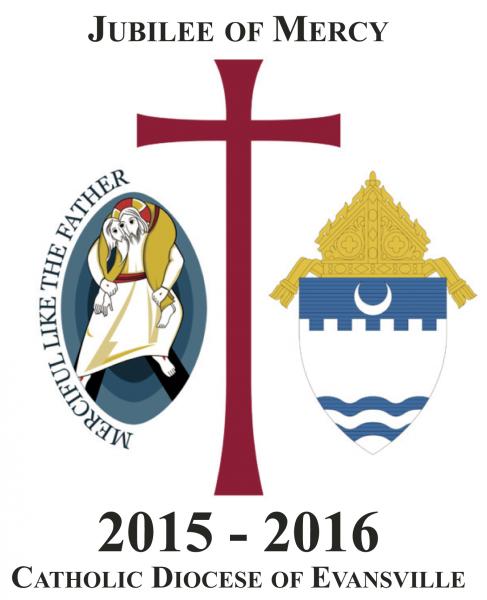
In order to indicate that mercy is available and present throughout our diocese, a special logo has been created that incorporates the Jubilee of Mercy logo and the Diocese of Evansville Crest. You will see the logo at or nearby many places across the diocese where the grace of mercy is – e.g. Reconciliation rooms, food pantries, St. Vincent de Paul Stores, outreach ministry locations, schools, etc.
The image on the left of the diocesan logo is the official logo of the Jubilee Year.
The left border of the official logo are the words: “Merciful like the Father” (Luke 6:36), which is part of Jesus’ Sermon on the Plain. These words act as an invitation to follow the merciful example of the Father who asks us to not judge or condemn, but to forgive and give love and forgiveness without measure.
The central figure is one of Christ, who has taken upon his shoulders the sinner; much like the Good Shepherd, Who rescues the lost sheep. Notice also that the figure of Christ and the one He is carrying share an eye. Here Christ sees with human eyes and humanity sees with Christ eyes.
The figures are enclosed in a mandorla, the almond shape, which recalls the coexistence of the divine and human nature of Christ. The three concentric ovals, with colors progressively lighter as we move outward, suggest the movement of Christ, Who carries humanity out of the darkness of sin and death. Conversely, the depth of the darker color suggest the density of the Father’s love who forgives all.
The image on the right is the Crest of the Diocese of Evansville.
The top of the crest is a bishop’s miter, identifying the crest as one that belongs to a diocese.
The crescent in the Catholic Diocese of Evansville’s crest symbolizes two important elements. Evansville, Ind., is situated on a bend of the Ohio River. As a result, it can suitably be called a “Crescent City.” The crescent also symbolizes the Blessed Virgin Mary, who is the patroness of the diocese.
Appearing immediately below the crescent is the representation of a crenellated battlement or fortification wall. This represents the original Fort Vincennes, established as a trading post, which suggests that the diocese derives from historic Vincennes, Ind., and that the Catholic Faith is a mighty fortress.
The two waves at the bottom of the shield represent the waters of the Wabash and the Ohio Rivers. The Wabash forms the western boundary of the diocese, and the Ohio forms its southern boundary. Spiritually, the waves represent the cleansing waters of Baptism.
The center of the logo is the cross – the place upon which the mercy of God was won for us by Christ Jesus’ death.
Look for more on the diocesan celebration of the Jubilee of Mercy in future issue of The Message.

